MASTERS OF CLAY & FIRE It's a throwdown.
Cleveland School vs. Denmark
CONOVER
& TAKAEZU
vs. SALTO
A.
Claude Conover
Cleveland, ohio
Ceramist, 1907–1994
ABOUT
Claude Conover, a Cleveland ceramist, born in 1907, creates architectural pieces of large proportion with small openings. His work is quite sought after. Claude Conover worked for 30 years as a commercial designer before turning to ceramics. By the 1960s he was devoting himself full time to his pots. He exhibited in 14 May Shows; all told his work was shown in 47 exhibitions at museums and arts centers around the country, some traveling internationally. Many regional patrons have made these hand-built stoneware pots -most off-white-some rough, some smooth, part of their home environment.
Conover is considered a member of the Cleveland School; a term first coined by Elrick Davis in a 1928 article for the Cleveland Press, titled "Cleveland's Art Pioneers Have Put City in Front Rank in Creative Field." He was the Ohio Arts Council’s recipient of the Cleveland Arts Prize in 1983.
Less well-known but equally inventive, Claude Conover (1907-1994) turned to pottery in midlife, after a 30-year career as a commercial designer. Born in Pittsburgh, he received his training at the Cleveland Institute of Art and began working in that city. By the 1960s, he was devoting himself to stoneware production in his studio.
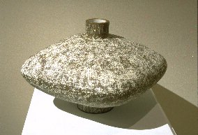
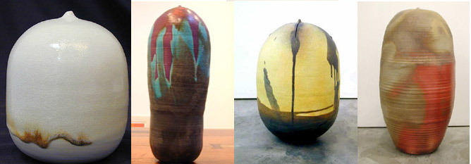
The majority of Conover’s works are variations on a single form – a vase or vessel with curved body and narrow neck. He did not throw these pieces on a wheel but constructed them from rolled clay slabs, patted and smoothed into place by hand.
The artist used subtly distressed finishes and glazes in a palette of earth tones – deep brown, desert beige and rock gray. The ceramics look almost like archaeological artifacts, uncovered in a mysterious excavation somewhere in South America or the Middle East.
Geometric designs are incised or impressed on the surface with blades and rollers. Some faint patterns resemble the remains of an unknown alphabet. Occasionally ornamentation cut in high relief projects from the side of a vessel.
B.
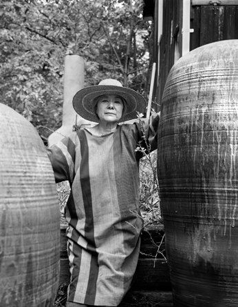
Toshiko Takaezu
Ceramist
cleveland, ohio
1929- 2011
ABOUT
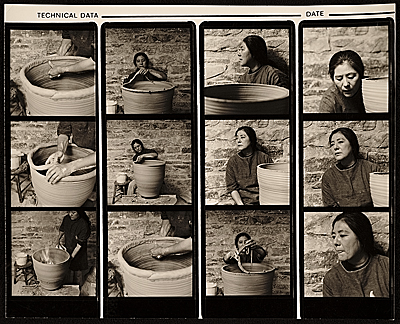
Toshiko Takaezu, born in Hawaii of Japanese descent, has been working in clay for over forty years.Her work has developed steadily throughout her career as she has moved from producing functional vessels to abstract sculptural forms.Over the years she has continued to draw on a combination of Eastern and Western techniques and aesthetics, as well as her love of the natural world. For Takaezu, the practice of building vessels in clay is intimately linked to everyday life: “In my life I see no difference between making pots, cooking, and growing vegetables.They are all so related.However there is a need for me to work in clay.It is so gratifying and I get so much joy from it, and it gives me many answers in my life.” Throughout her career, Takaezu has explored a select repertoire of forms, often focusing on the vertical closed vessel that has become a symbol of her work.While her earlier pieces were almost exclusively wheel-thrown, as she began envisioning larger forms she incorporated hand building techniques as well, which allowed her to grow her vessels vertically and eased the circular restrictions of the wheel.The simple, cohesive structures she is now well known for are united by their common form but gain individual character through the painterly aspects of their surface decoration. Takaezu’s spontaneous approach to glazing, in which she walks around the vessel freely applying glaze through pouring and painting, balances her more methodical building process and allows her to add an improvisational element to her work. Another important aspect of Takaezu’s involvement in clay has been her roll as a teacher.Her love for clay is infectious, and she has shared it in many forms.In addition to her 23 years of teaching at Princeton and the many workshops she has performed, she has given her time to generations of apprentices.The many awards and honors she has received, from the Hawaii Living Treasure Award to her honorary doctorate degree from the University of Princeton, demonstrate the wide range of people and institutions that find inspiration, history, and meaning in her work and life.


c.
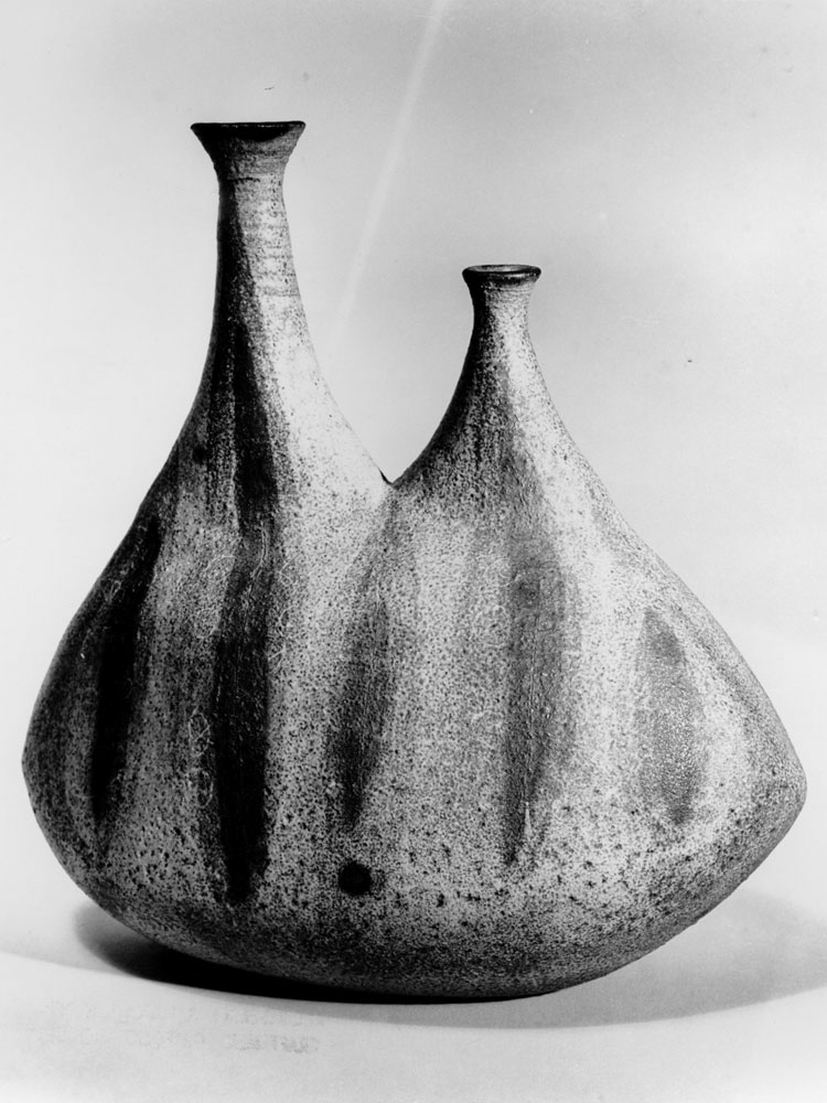
Axel Salto
Ceramist
Copenhagen
1889-1961
ABOUT
Axel Salto is counted among the masters of Danish design, although his tenets for creative work often went against the functionalist aesthetics of his contemporaries and successors. Salto's decorative ceramics were couched in sculptural, rather than functional, forms. His outcome was highly respected, and his pieces were bought during the height of his career for the collection at the Copenhagen Industrial Arts Museum. Formally trained at the Copenhagen Academy of Art, his style evolved from heavy, somber woodcuts, to painting and ceramics. He painted his entire life, illustrated several books of children's stories and poetry, designed textiles for L.F. Foght and was one of the founders of the journal Klingen, in 1917. It was his sensual and unprecedented approach to ceramics, though, that brought his career into the international spotlight. Salto's early work is inspired heavily by classical languages and Greek mythology -- his undergraduate major -- as well as by the visual motifs of Art Deco, religious and especially demonic iconography. His pieces later turned to the forms of nature, such as seedpods, budding flowers or fruit, for their fertile energy and form. Salto's approach was to "create in accordance with nature, rather than to copy its exterior." Using relief patterns on the surface of his pieces, Salto was also able to use his ornamentation as a vehicle for the different glazing techniques. Rows of "seeds" or a more angular hive pattern on the outside of a vase would reveal the properties of the glaze as it slide between grooves, exposing its varying thickness and sheen. He worked first at Bing & Grondahl from 1923-29 and later at Royal Copenhagen where he developed several glazes specifically for his pieces and experimented with colors new to the Danish palette, like bright turquoise. Salto maintained his own studio as well, primarily for his painting, but also for his collaborations with other artists like Carl Halier. Salto's best known works are grouped into three categories: "budding," "sprouting," and "fluted." The names refer to the form of the pieces, which range from the angular horn shapes to low, rotund vases. Salto's work was unique for its time because of his uninhibited and passionate approach to developing and manipulating new shapes and colors. This energy went against the prevailing trend, which was to create in the serene, cool style of Japanese and Chinese ceramics. He won a number of awards, including a silver medal for work he did at Bing & Grondahl at the 1925 Paris World Exhibition, the 1937 Paris World Exhibition Grand Prix and the 1951 Milan Triennial Grand Prix.


.jpg)